On Fri, Aug 31, 2012 at 4:21 PM, Steve wrote:
Brother Bob......
We are having a friendly family political discsussion (if that's possible, I think that's an oxymoron) regarding the following charts....... Your view please!
[Each original chart included in the email will be preceded by this graphic.]
Source:
frugal-cafe.com
(quote from the site:)
Consider this a sanctuary for conservative discussions and exposing government actions that don’t adhere to the principles of our founding fathers and our US Constitution. A variety of charts representing the many disasters Obama and hissocialist/Marxist minions
have created:
First of all (and in spite of the source), it's a little deceptive to look at "Clinton Years" and "Bush Years" and "Obama Years" because the unemployment rate is a lagging indicator. It is a response to events that occurred prior. From About.com:
This means it measures the effect of economic events, such as a recession. The unemployment rate doesn't rise until after a recession has already started. It also means the unemployment rate will continue to rise even after the economy has started to recover. [Emphasis added]
Why is that? Employers are reluctant to lay people off when the economy turns bad. For large companies, it can take months to put together a layoff plan. Companies are even more reluctant to hire new workers until they are sure the economy are well into the expansion phase of the business cycle. During the 2008 financial crisis, the recession actually started in the first quarter of 2008, when GDP fell 1.8%. The unemployment rate didn't reach 5.5% until May 2008. It reached its peak of 10.2% in October 2009, after the recession had ended. In the 2001 recession, unemployment went from 5.6% in 2002 to 6% in 2003, even though the recession ended in 2002.
Second, very few things are wholly a result of one president's term. For example, if we look at average market performance for a 48-month period, it makes a huge difference which 48-month period we look at. Beginning just two months earlier or later could make a big difference in the statistics garnered. The sampling size has to be great enough to be measurable and not merely reflect a result that could have been achieved randomly. (See "The Law of Large Numbers")
Now don't get me wrong -- there are things that can be attributed to a president's term -- President Obama gets credit for the health care bill just like President Bush gets credit for his tax reductions.
And here's one more interesting chart (courtesy of the good folks at Hamilton Place Strategies, an economic-minded Republican consulting firm):
Source: FOXnewsinsider.com: We are the official Live Blog of Fox News Channel.
This chart is blatantly inaccurate:
During Bush’s first term, on average, 2,598 new leases were issued per year, 4,166 permits approved each year, and 2,994 new wells were started annually
During Bush’s second term, on average, 3,360 new leases were issued per year, 6,264 permits approved each year, and 4,884 new wells were started annually.
During Obama’s first term, on average, 2,546 new leases were issued per year, 4,273 permits approved each year, and 3,231 new wells were started annually.
So oil production on public lands has not all but ceased. In fact, it is slightly higher than Bush’s first term.
Source: CBSnews.com
This is indeed true. But it's not the whole story. If my household debt increases it doesn't necessarily mean that my family is spending more. It could mean that I lost my job and have to rely on credit to pay bills. And perhaps I am spending more, but it's because my wife got sick and the medical bills are outrageously high, or because my parent died and left a tremendous amount of debt that I am now responsible for.
There's no indication of why the debt increased so much in this chart and, like a baseball flying through a window, it matters whether the shattered glass was a result of an intentional or accidental throw.
In other words, to assume that the debt is entirely a result of increased spending is not the honest way to look at it.
First off, Obama governed for much of the first nine months of his administration under the last budget of the Bush administration. But he did push an $800 billion-plus economic stimulus program through Congress early in his term, some of which was spent before that budget year ended in October. Bush's original budget proposal predicted a $407 billion deficit for 2009, but the final figure was $1.4 trillion, according to White House figures.
Spending has gone up under the Obama administration: For the 2011 fiscal year, the second full budget of Obama's term, the federal government spent about $3.6 trillion, according to the White House budget office. That's about $600 million more than in 2008, the last full year under the Bush administration.
But the budget gap has another element: Tax revenues have dropped during the 2007-2009 recession and remain lower than before. In the 2007 budget year, which ended shortly before the recession began, the federal government brought in nearly $2.6 trillion; that number fell to $2.1 trillion in 2009 and is projected to total $2.4 trillion by the time this budget year ends in September.

Also, according to the chart above, there was slack revenue for a number of years after the recession at the start of Bush’s presidency. After the passage of the 2001 and 2003 tax cuts, those years of lost revenue also impacted the national debt. In addition, the chart shows a steady increase in spending under Bush.
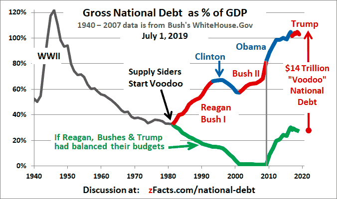
Another interesting chart:
National Debt Graph by President
The national debt actually fell during Clinton's presidency, but Bush 43 took the debt from $5.6 Trillion in 2000 to $12.3 Trillion in 2008. In other words, Bush doubled the national debt during his presidency. It was upon this backdrop that Obama became President.theurbanpolitico.com
And for a longer-term perspective (through 2008):
I've included the above charts for two reasons:
(1) The information is quite accurate but the difference in presentation is important. The first chart is fairly straighforward and matter of fact. The latter is certain to engender an emotional response because of the way the information is presented. It makes it harder to swallow for those who are reluctant to believe in the underlying truth of the statistics.
(2) This only goes to show that you can find practically anything to support a point of view, if that's what you're trying to do. For instance, all of the graphics in your original email, Steve, can be found at this website:http://ironicsurrealism.com/tag/oil/
. Searching for support for a particular point of view is an example of confirmation bias -- that, instead of searching for ways to prove our ideas wrong, we usually attempt to prove them correct -- something as humans we are prone to do and have to constantly be aware of in order to arrive at any conclusion that is factual and independently trustworthy. In fact, way back in 1620, Francis Bacon wrote, "the human understanding, once it has adopted an opinion, collects any instances that confirm it, and though the contrary instances may be more numerous and more weighty, it either does not notice them or else rejects them, in order that this opinion will remain unshaken." (For more on this, see http://youarenotsosmart.com/2010/06/23/confirmation-bias/
or http://www.sciencedaily.com/articles/c/confirmation_bias.htm
or http://en.wikipedia.org/wiki/Confirmation_bias
.)
(3) There is even more to add to the problem of seeking corroborative information. Here's a passage from The Drunkard's Walk: How Randomness Rules Our Lives, by Leonard Mlodinow, who teaches at Caltech:
"To make matters worse, not only do we preferentially seek evidence to confirm our preconceived notions, but we also interpret ambiguous evidence in favor of our ideas. This can be a big problem because data are often ambiguous, so by ignoring some patterns and emphasizing others, our clever brains can reinforce their beliefs even in the absence of convincing data.* For instance, if we conclude, based on flimsy evidence, that a new neighbor is unfriendly, then any future actions that might be interpreted in that light stand out in our minds, and those that don't are easily forgotten.** Or if we believe in a politician, then when she achieves good results, we credit her, and when she fails, we blame circumstances or the other party, either way reinforcing our initial ideas." (p. 190)
*My point with the debt data above.
** Also known as the "halo effect" (and, yes, it works both ways, positively and negatively).
The way around the confirmation bias problem is to realize that our brains are practically made to jump quickly to conclusions; to attempt to overcome our prejudices; to begin to recognize that even random events produce patterns (that is, not everything that happens means something); to question our perceptions and theories; and, perhaps most importantly, to learn to spend as much time looking for evidence that we are wrong as we spend searching for reasons we are correct.
Source: Wall Street Journal 2011
|
First, this is almost a year old. The source is an article in the WSJ written by Michael Boskin, "a professor of economics at Stanford and a senior fellow at the Hoover Institution [who] chaired the Council of Economic Advisers under President George H.W. Bush."
Reporter for WSJ: As you look at an assessment of the Obama presidency, what are the numbers that kinda jump out at you?
Michael J. Boskin: I think there are three simple points to make: (1) He certainly inherited the recession financial crisis; he didn't cause it. But his policies have not succeeded in restoring economic growth in output or in jobs especially.... There are fewer people working today than in June of 2009 when the recesssion ended and recovery began.... The other thing I would say that sticks out is if you go to look at his individual policies with a few non-trivial exceptions, most have been disasters, measured prima facie on their own goals.... [Note: Emphasis added. The author doesn't delineate three points exactly.]
The video continues and you're welcome to watch all 12 minutes on the WSJ website.
Again, most of these things are long-term results of policies put in place by previous administrations (both Democratic and Republican) or by previous congresses (again, both Democratic and Republican) -- it's naive to think that, outside of a piece of specific legislation or things like starting wars or squandering a surplus, everything that occurs within a four-year term is a direct result of a president's influence (or a Speaker's, for that matter) -- certainly there are things in the congressional pipeline that previous administrations approved (for example, the horrific NAFTA agreement made by Clinton) that affect a new administration's bottom line. (It reminds me of the woman studio head who was let go because she had three years of bad film picks, yet, after she left, the films she had given the go to in the pipeline for the next three years were tremendously successful. Any honest person will admit that a great deal of success is due to luck.)
The other thing I have to wonder about these facts, assuming their validity (and I don't have the time to research each one; I'll take that they're true) is that, if you looked at them say, halfway through Bush's two terms, would the percentages be that much different, because of the length of the sample frame ("since 1930s", "since WWII")?
Okay, brother Steve, I think it only fair at this point that you take a moment to explain this graph to me. I want to know what you think it means.
(And, honestly, this one's a little confusing to me. I'm not sure what "job loss" actually means in this context.)
Source: The Heritage Foundation, a conservative think tank
Let's dig a little deeper. These are figures I've gleaned from the site usgovernmentspending.com
. First, actual 1950 stats:
Next, estimated 2010 stats:
Here are two charts I just made in Excel tracking (1) defense spending and (2) transportation spending over the same period (1950 - 2010):
Now here's the rub: Any chart that shows spending in any category will show such a dramatic rise between 1950 and 2010.
The real numbers that matter (and why I included the pie charts above) should be the percentage of GDP increase. Which, in the case of the welfare category, went from 4% to 15% -- hardly a radical change with the aging population.
10 Sept 2012 - THE REAL STORY:
From the Wall Street Journal's MarketWatch.com:
The original chart accurately reflects the average number of participants in the Clinton and Bush administrations (23,340 and 23,524, respectively). (The red line underlines the Clinton years, the green the Bush years.) I drew in the BLACK LINE because that's the number we're interested in (the Average Participation). The figure for Obama is slightly high: 39.5 when the actual data reflect 36.7.
But these numbers alone do not tell the whole story.
Food stamp enrollment has been rising for more than a decade. President Bush launched a recruitment campaign, which pushed average participation up by 63% during his eight years in office.
Nearly the same number of people -- 11 million -- joined the program during the Bush and Obama administrations, according to Department of Agriculture records. Of course, the jump during Obama's tenure has come in only three years.
Also, food stamps are available to anyone who meets the criteria, generally having a monthly net income below the poverty line -- about $18,500 a year for a family of three -- and assets of $2,000 or less. Even with the ramp-up, an estimated one in four eligible Americans do not participate, according to the left-leaning Center on Budget and Policy Priorities.
Much of what's driving the steep climb in enrollment is the nation's worst economic downturn since the Great Depression, when the food stamp program was created.
Food stamps have become
a lifeline for the millions of long-term unemployed. More than 20% of those unemployed for more than six months received benefits, according to Congress' Joint Economic Committee.
Source: Bureau of Labor Statistics
I spent at least a half hour combing the BLS website trying to find raw data that would reflect "US JOBS BY QUARTER" as shown in the chart above, but to no avail. But I will say that you can't have it both ways -- whom are you blaming, the President or Congress?
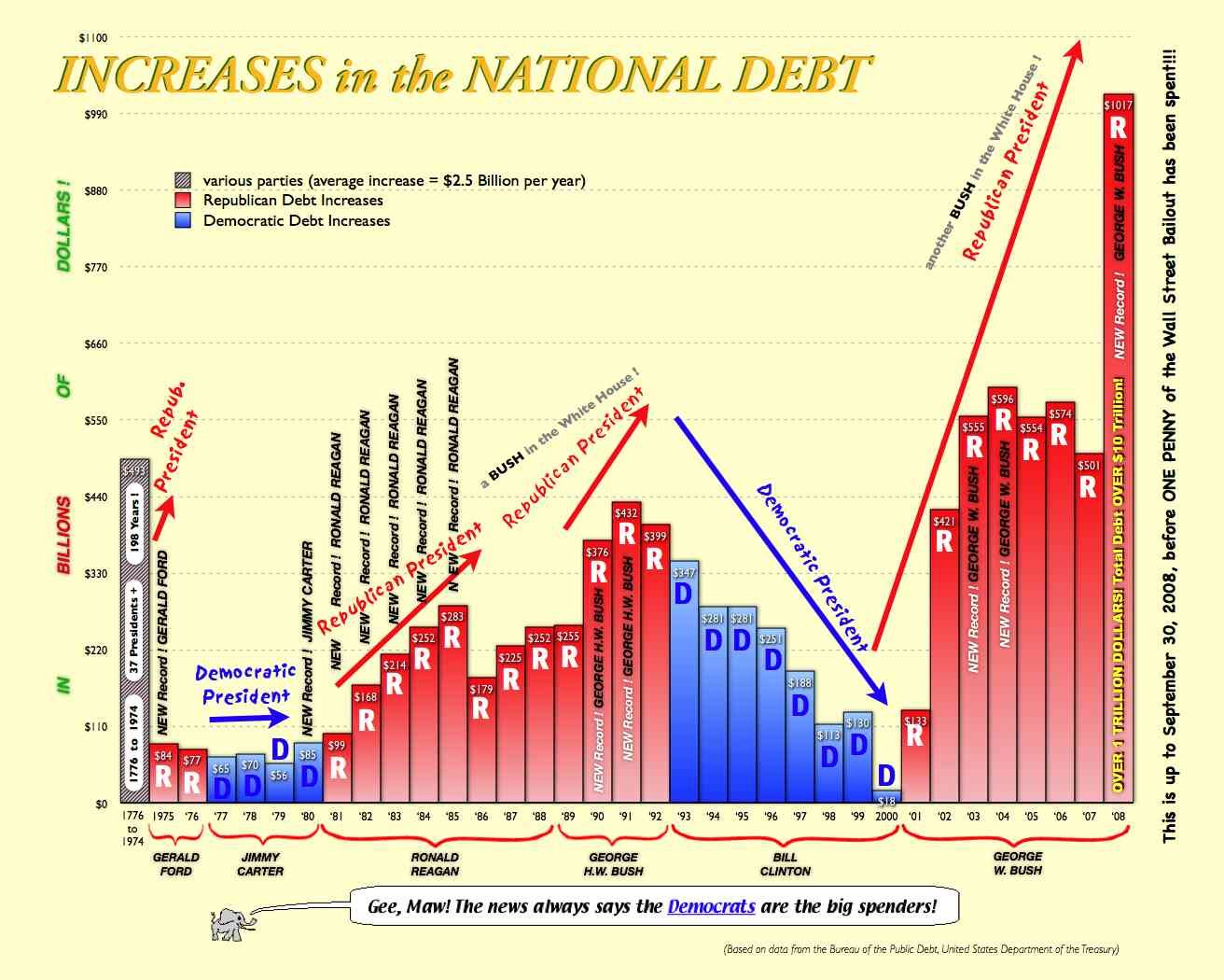
And a fun one from the Washington Post:

I couldn't find the source of this chart, and I'm not sure if its creator intended to speak about debt or the deficit (or the debt ceiling, of which Reagan oversaw the highest number of increases - http://blogs.cfr.org/lindsay/2011/07/22/friday-file-debt-deal-deadline/). Anyway, using the Speakers of the House as any kind of barometer ignores the fact that we have a bicameral Congress. The House can't do anything without Senate approval. (Although, according to one politically right website, "The Republican-controlled House of Representatives, which took office in January 2011, has enacted federal spending bills under which the national debt has increased more in less than one term of Congress than in the first 97 Congresses combined."; see the Media Research Center's page at http://cnsnews.com/news/article/debt-159t-under-gop-house-more-15-months-first-97-congresses-combined.) That said, here is, I think, a more accurate and fairer chart (from a moderately conservative blogger), in that it delineates the reality that Congress and Presidents often do not work together in concert:

Here's another bit more detailed version of the same info:
And I just had to include this very interesting chart from the same website, which speaks to the issue of reducing taxes to increase government revenue.:
Source: purported to be the Wall Street Journal -- I could not confirm that attribution. Regardless, the figures are inaccurate on at least three counts:
(1) The top two tax rates will increase, one from 33 to 36 percent and the other from 35 to 39.6 percent.
(2) The top rate applied to capital gains is 20%, not 28%.
(3) Dividends would be taxed like normal income, depending on the individual's tax bracket (not automatically at 39.6%).
The 2010 Estate Tax figure is quite misleading, since that's the only year that it's at zero percent. The current rate is a 35% tax after the first $5 million. Obama's plan calls for restoring the previous level of a 45% tax after a $3.5 million exemption imposed on assets passed to heirs.
And this chart conveniently omits the business-positive aspects of Obama's plan -- namely, that he would lower the top corporate rate to 28% from 25% and that businesses would get a 20% income tax credit to move operations into the United States while tax deductions for shifting operations abroad would be dropped -- what could be more pro-American than that?
Under Mitt Romney's tax plan
, the federal government would lose $3.4 trillion. That's in large part because Romney has not yet specified how he would pay for his proposed 20% reduction in tax rates across the board.
I added that last quote because I'm not convinced that Republicans (like yourself) have analyzed the implications of Romney's tax plan as thoroughly as you've studied the Obama chart. (Did you know Romney would also repeal the Alternative Minimum Tax?) So let's take a look at both plans in one convenient graph:
This graph was prepared by Naomi Robbins, who does the charts for FORBES magazine. The population spread is evenly spaced.
So what do we see?
Well, the top 60% under Romney's plan get a decent cut, with a huge cut for the top few percent (almost 8% reduction), and, funny, a significant tax increase for the bottom 20% (he lets expire some temporary tax breaks for the folks at the bottom). Obama's plan keeps the current tax rates for almost everyone but the top few percent (and the increase, 6%, is less than Romney's reduction).
As usual, this isn't the whole story either. Romney has yet to provide information as to how he would make up for lost revenues from these tax cuts (he's said he would cut spending and reform taxes but no details are forthcoming). (He's also said, by the way, that he would increase defense spending and keep Medicare and Social Security solvent through the next decade but, again, hasn't shown us how he would do that. And if he makes program cuts that affect the middle class and the poor, the chart above doesn't begin to reflect that.)
So, that's my response to your request for my take on these things in this friendly family debate (although I don't know what elements of the family are actually involved in the debate, since I was the only one the email was addressed to ... SO I've taken it upon myself to include the fam in the cc:s.
If you have any questions about stuff, let me know.
In closing, I'd like to quote this other cool book I'm reading, Thinking, Fast and Slow by Daniel Kahneman. It's about the way the mind is wired to think. This particular passage pertains to a study wherein people were exposed to legal scenarios and given evidence that they knew was one-sided. The participants were able to easily generate arguments for the other side when they were determining the judgment in the case.
"Nevertheless, the presentation of one-sided evidence had a very pronounced effect on judgments. Furthermore, participants who saw one-sided evidence were more confident of their judgments than those who saw both sides. This is just what you would expect if the confidence that people experience is determined by the coherence of the story they manage to construct from available information. It is the consistency of the information that matters for a good story, not its completeness. Indeed, you will often find that knowing little makes it easier to fit everything you know into a coherent pattern."
Most of the time this serves us pretty when we have to make quick sense of incomplete information in a complex world. His point is that it's easy to be overconfident in our ability to make everything fit together nicely (to tell a good story, as it were) -- the world is much messier and harder to figure out than that. Kahneman again: "We often fail to allow for the possibility that evidence that should be critical to our judgment is missing -- what we see is all there is."
Love you!
# 3
P.S. Fortunately (in spite of what John Sununu says), fact-checking organizations do a great public service by keeping politicians honest. Here are a few worth bookmarking:
AND